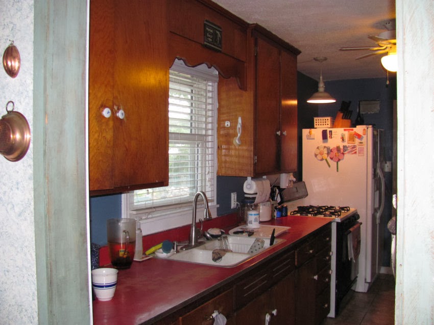
We spent the end of 2012 and pretty much all of 2013 remodeling our kitchen....doing what we could as we could. A project a good 20 years in the making! Of course now I know why my folks didn't get air conditioning until us kids were out of the house - less mouths to feed and a few extra pennies available! LOL
Anyway, I mentioned some time ago I'd share some pics and here's just a few.
I do need to mention that some call this a "galley" kitchen... I've always called it a "hallway after thought!" Yeah it's small, but I really wanted to do something to make it appear bigger. And, of course, now the red Formica counter tops are back "in". As for me, I guess I've just been retro and now ready to move on! hehehe
Here's one side: before
and after....
I love the white cabinets and dark blue counter tops!
I love the microwave over my 5 burner stove top!
Now I finally have more room for my big honkin' canners and pots!
If you can see it, there's one cutting board that has a pic of a lady doing laundry.
That was my gramma's. She passed in 2002 at the age of 98!
And the other side of the kitchen.... before....
after!
I love my built in oven!
Getting older and the kind of work I do,
my back has issues, so not bending over to get something out of the oven or broiler is so awesome!
new pantry door...
I also love having room above the cabinets to put a few of my pretties!
To get the pic below I had to stand in the pantry! hawhawhaw
Well I love it and can't stop staring at it. If it was big enough to have a little tiny kitchen table and a couple of chairs I'd probably just sit in there and ooohhh and ahhhh.
Thanks for stoppin' by!
Blessings
Debbie


13 comments:
It is wonderful. The white really made it look bigger! I love the counter tops and floor. Yep stand and drool awhile it was along time coming but so worth it. Warm Blessings! Amy
It is beautiful!
Wow! What great before and after pics! Looks sooo good! ENJOY ENJOY! (did you redo the floor too? It looks great with everything) ~*~Lisa
Yup the floor is different too. Ceiling to floor. I'm so in love with this room! :-)
Evening, so beautiful, love the nice bright look to the kitchen, very nice, Francine.
Love your remodeled kitchen, it is so pretty! hugs, Lecia
You did an amazing job. It looks BEAUTIFUL.It looks like a different homestead.
Blessings,
Tricia
WoW! What an amazing transformation. Awesome!
I would put a chair in the room and stare too:)
It was all worth the wait.
You 've got me thinking:)
I LoVe what you did with the wall on the other side. Hmmmmmmmm!
I would love to create a coffee centre and more cabinets soooooooo
Love it!!!
You did a wonderful job.
The white really makes it look bigger!
Enjoy!
Prim Blessings
Robin
WOW!
Donna
Wise choice with the color! Your kitchen does look bigger with the white cupboards. Not to mention, it also seems cleaner and brighter. The black countertops also add a touch of elegance. Nice job!
Lynn Williamson
Hi Debbie, we underwent the same remodel ourselves last year and I have to say never again! Yours looks wonderful, light and airy and spacious, you planned it all really well. Thanks for sharing
Post a Comment